
Creating a
design hub for everything Toyota.
The Brief
Build a centralized platform for Toyota’s brand guidelines, design systems, and assets — accessible to both internal teams and external partners.


We were limited to existing photo assets, it was a small constraint and easy to work around
We grouped content into intuitive categories, prioritized quick access to high-traffic resources, and planned for growth — knowing new sections (like voice & tone or photography guidelines) would be added over time.

A closer look at Toyota’s iconic brand colors and how they’re applied across the system.

HEX EB0A1E
RGB 235 10 30
CMYK 00 100 90 00
PMS 186C

HEX FFFFFF
RGB 255 255 255
CMYK 00 00 00 00
PMS N/A
This wasn’t just about building pages and components — we worked closely with our content partners to craft a cohesive, useful brand experience.
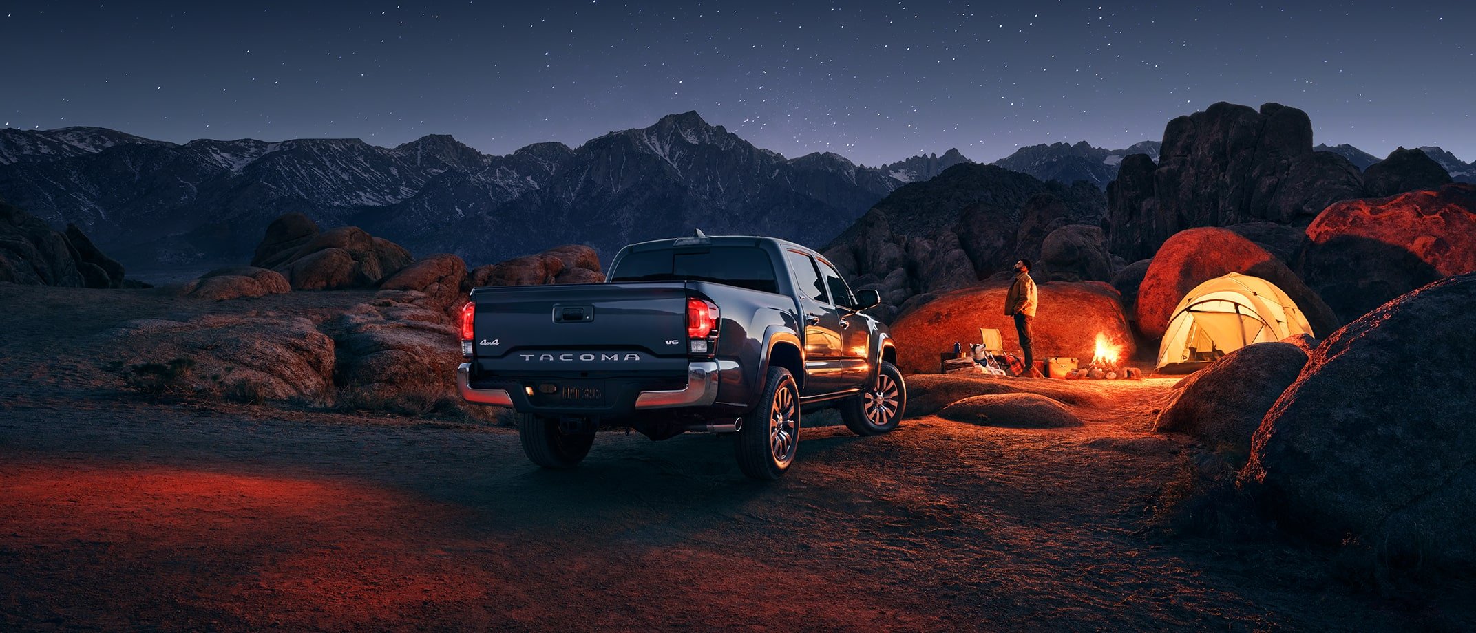
When general photography didn’t quite capture what we needed, our content team stepped in to create tailored visual assets.

HEX 58595B
RGB 88 89 91
CMYK 00 00 00 80
PMS Black C - 80% TINT


Adding interactivity was a fun goal throughout the project. Implementing sliders throughout the page, users can explore how color grading impacts the look and feel of Toyota’s photography.


The color grading story continues in Toyota’s video content, highlighting consistency across mediums.